Question Settings
An insight to some of the various question settings
When adding various question types to your form, you might notice that some contain the same settings. These question settings allow you to edit the display and functionality in order to improve your form overall.
There are four standard question settings that you can add to every available question type
Freeform Text
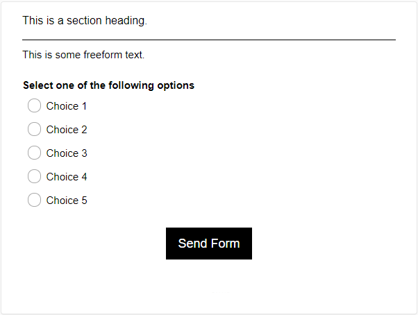
The text above the question is the freeform text.
Allows the form creator to add extra information in relation to the question or statement.
The text can be displayed:
- Before the section.
- Before the question.
- After the question.
- After the choices.
The text editor box has multiple features:
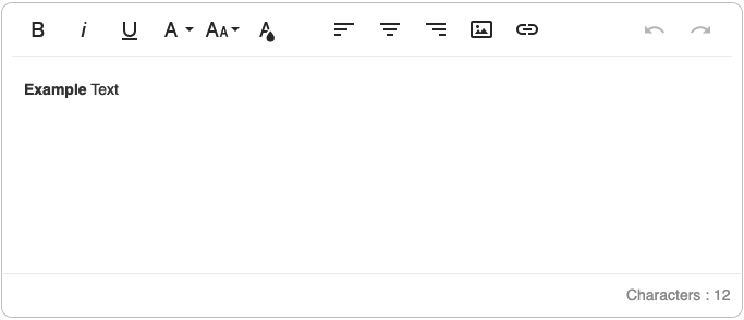
Each icon is described in the table below:
Icon |
Icon Name |
Description |
 |
Bold |
Make your selected text 'Bold'. |
 |
Italic | Make your selected text 'Italic'. |
 |
Underline | Make your selected text 'Underlined'. |
 |
Font Family | Edit the font type of the selected text. |
 |
Font Size | Edit the font size type of the selected text. |
 |
Text Colour | Edit the font colour of the selected text. |
 |
Align Left | Edit the alignment of the selected text to the left. |
 |
Align Center | Edit the alignment of the selected text to the center. |
 |
Align Right | Edit the alignment of the selected text to the right. |
 |
Insert Image | Insert an image to the selected text from your files, by URL or from your asset library. |
 |
Insert Link | Insert a hyperlink to the selected text. |
 |
Undo | Undo the last edited textual change made. |
 |
Redo | Redo the last edited textual change made. |
 |
Characters | Displays the number of characters in the 'Text' box. |
Section Heading
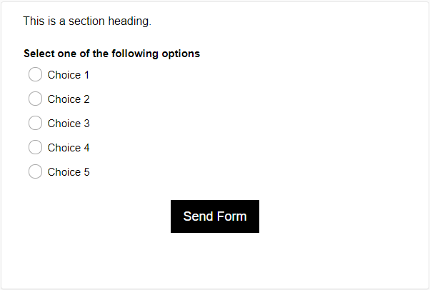
The text above the question is the section heading.
Edit the text displayed before a question to signify a new grouping or title. The question must be on a new page for this title to appear.
Display a Division Bar
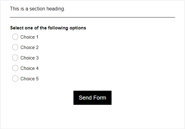
The black line beneath the section heading is the division bar.
Display a horizontal line after the question which can be used as a divider between questions. This is often used to group sets of questions together and it can be styled from the 'Design' settings.
Force a Reply for this Question

Enable the mandatory completion of this question. In 'List View', click on the button within the 'Force' column to enable this option. By default, required questions are marked by an asterisk ( * ) on the form to the respondents.
If a required question is not answered, they will not be able to advance to the next page until they answer the question within the requirements. When you look at your results, you may notice that some respondents might have skipped required questions. This could mean that the 'Decision' logic has skipped them past the required question. You should revisit any 'Decision' questions within your form to ensure it functions as it should.
Jump to

If you have a multi page form, the question that is placed as the last one on the page will have a 'Jump to' feature available. It is similar to the 'Decision' question type, but any question type can have this feature if placed as the last one on a page, This can be used when respondents don't need to fill out every question on a large form.
Jump to: Select the page number you want the respondent to go to.
Next Button Label: Edit the label for the 'Next' button on the specific page.
Question Group Specific Settings
The following settings are available to specific question types that are listed below:
Randomise Choices
The question choices are reordered upon every refresh of the page.
The 'Randomise Choices' question setting will reorder your choices every time the form is presented. The order of choices will change when the form is opened by the respondent, or when the browser tab is refreshed. This is a useful option when presenting choices that are opinion based as it will minimise question order bias and improve overall data quality.
This question setting is available within the following question types: 'SingleSelect', 'MultipleSelect' and 'DropDownSelect'.
Display Choices in _ Columns
The column display options are: 1, 2, 3, 4, 6, 12.
The 'Display choices in X columns' question setting will display your choices in a certain amount of columns. This is a useful option to improve the overall aesthetic of your form, or to save space when a large amount of choices are available to the respondent.
This question setting is available within the following question types: 'SingleSelect', 'MultipleSelect' and 'LongSelect'.
Encrypt/Decrypt Question Data on the Server Database

The question entry data in the last column displays as random lettering due to the encryption on the server database.
The 'Encrypt/Decrypt Question Data on the Server Database' feature allows for the encryption or decryption of the respondents input data. The data can only be accessed via the form creators account and will be decrypted when it is downloaded or viewed from your account. See the above image for an example of what encrypted data will look like to anyone who is attempting to view it on a different account.
This question setting is available within the following question types: 'Input' and 'SingleInput'.
Display Format
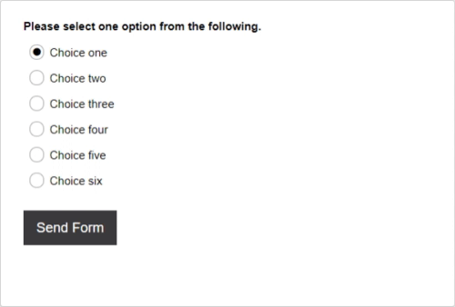
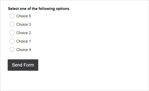
The first image is a 'Drop-Down Select' list, the second image is a 'SingleSelect' list and the third image is a 'Multiple Select' list.
The 'Display Format' question setting edits the display of the choices for the respondent to either select one option or more than one option from your available choices. This is a useful option when you have a large amount of choices to present to the form respondent, and to improve the aesthetic of your form. The 'SingleSelect' (radio buttons) and 'Drop-Down Select' (drop-down list) choices are both singular selecting options. The 'Multiple Select' (checkbox) choice allows for more than one option to be selected. The 'Text Field' choice allows the respondent to input a small textual answer.
This question setting is available within the following question types: 'LongSelect', 'Decision', 'Survey', 'Calculated' and 'JumpTo'.