Design
Learn the customisation options to enhance the look of your form
The 'Design' heading allows you to customise the overall aesthetic of your form. Aesthetically, almost everything can be changed on your form, and preset themes (specific to one form - contact your Administrator for application wide theme) can be incorporated in this section too.
To access the 'Design' section when editing a form, go to 'Settings' \ 'Design'. Alternatively, when in the 'Dashboard', go to 'Action' \ 'Design' on the specific form row you would like to customise.
The main design page is split into two panes. The right hand pane provides a view of the current design settings, and the left hand pane allows access to each of the design elements of the form. Clicking on the tab will allow each of the elements to be edited. Changes are shown in the right hand pane as they are updated and saved. Once all the elements are set how you want them to be, click on the 'Save' button to make them permanent.
Select one the following sub-headings for more information:
Layout |
Header |
Typography |
Buttons |
Footer |
Themes |
Custom Styles |
Design Settings
The 'Design' sub-heading displays the form settings in the left hand pane and the actual view in the right hand pane.
The Design Elements which may be set are as follows:
- Layout: The Form and Page Layouts, including main colours and sizes.
- Header: The Header bar including Form Title and Logo.
- Typography: The individual form attributes e.g. Question and Section, font, colour and size, Dividers and Progress Bar.
- Buttons: The buttons used in the form.
- Footer: The elements at the foot of the form. e.g. contact details.
- Themes: Create, apply, change, or delete design themes.
- Custom Styles: Input your own custom CSS code for your form.
When editing a form aspects colour, you can use the inline colour picker or select your own colour using the 'Hex Colour Code' format.
Icon |
Icon Name |
Description |
 |
Save Changes | Press the 'Save Changes' button to save the edited design changes of your form. |
 |
Preview | Press the 'Preview' button to preview the edited design changes of your form. |
CSS Font-Size Scaling
When editing a form aspects size, you will need a basic understanding on CSS font-size scaling:
Pixels (px): One pixel is equal to one dot on a computer screen (the smallest division of your specific computer screen's resolution). Using px will NOT scale downward to fit mobile devices.
Points (pt): One point is equal to 1/72 of an inch. Using pt will NOT scale downward to fit mobile devices.
Ems (em): One em is equal to the current font-size of the document, e.g. if the set document font size is 11pt, then 1em is equal to 11pt.
Percent (%): 100% is equal to the current font-size of the document, e.g. if the set document font size is 11pt, then 100% is equal to 11pt.
Layout
The 'Layout' sub-heading allows you to customise the page and form layout, along with background settings for your form.
Page Layout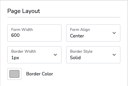
Edit the width of your form (using px = pixels).
Set the position of where your form will align on the page.
Edit the form border width (px = pixels) to add a layer to your form.
Edit the form border style to change the look of the border on your form.
Edit the form border colour to make your form stand out from the page and the actual form itself.
Backgrounds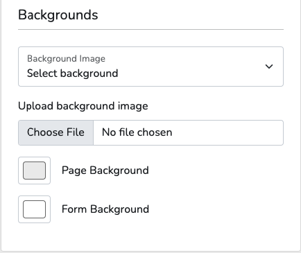
Background ImageBackground Image
Edit the form background to be one of the default backgrounds from the drop-down menu. All default background images are set to 'Repeat' automatically.
Upload Background ImageUpload Background Image
Edit the form background to be an uploaded image from your files.
Page BackgroundPage Background
Edit the page background colour to make the page stand out from the form.
Form BackgroundForm Background
Edit the form background colour to make your form stand out from the page.
Header
The 'Header' sub-heading allows you to customise the logo and title on your form.
Logo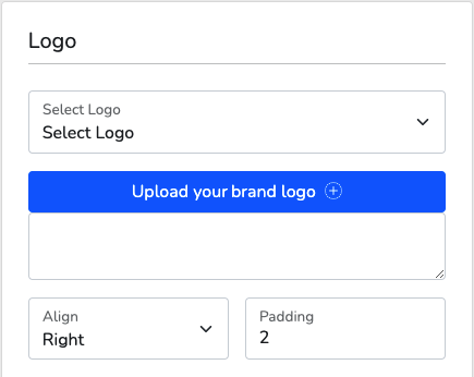
Select a logo for your form. Logos can be uploaded to this section from the 'Upload a Logo image' setting.
Upload a Logo ImageUpload a Logo Image
Select a logo to upload from your files.
Edit the positioning of your forms logo and where you would like it to be displayed.
Edit the amount of padding (pixels around the edges of an image) on your logo.
Form Title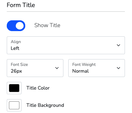
Edit the display of your form title. Your form title is the same as when you first create it.
Edit the positioning of your forms logo and where you would like it to be displayed.
Edit the text size of the title font.
Edit the text size to enlarge it to 'Bold' to make the title font stand out from the rest of the header.
Edit the title colour to make your title stand out from the rest of the header.
Title BackgroundTitle Background
Edit the title background colour to make your title stand out from the rest of the form.
Progress Bar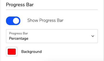
Note! The progress bar only works on multi-page forms.
Show Progress BarShow Progress Bar
Check or uncheck this box to show the forms progress bar displayed below the title. We recommend you enable this option if your form is multi-page.
Edit the progress bar display to either 'Percentage' (percentage of the form completed) or 'Pages' (number of pages of the total number completed). The 'Pages' option will only work if your form is multi-page.
Edit the progress bar colour to match your forms theme.
Typography
The 'Typography' sub-heading allows you to customise the question, answer and section heading settings on your form.
Question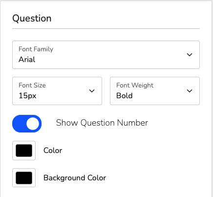
Edit the form font from the default drop-down list provided. The set font selected here will be set for all elements on your form.
Type your dropdown text here
Type your dropdown text here
Show Question NumberShow Question Number
Check or uncheck this box to show the forms question numbers that appear next to the question. We recommend you disable the question numbers for a better aesthetic for your form.
Edit the question text colour to match your forms theme.
Background ColourBackground Colour
Edit the question background colour to make your questions stand out from the rest of the form.
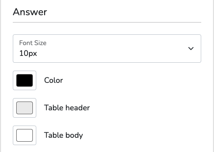 Answer
Edit the question response (the text displayed as the options in a question) font size.
Edit the question response text colour to match your forms theme.
Edit the heading row background colour for a 'Survey' or 'Ranked' question type.
Edit the body rows background colour for a 'Survey' or 'Ranked' question type.
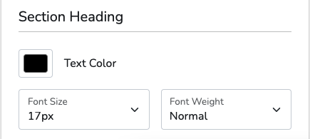
Section Heading
Edit the section text colour to match your theme.
Type your dropdown text here
Type your dropdown text here
Buttons
The 'Buttons' sub-heading allows you to edit the look and text within the default 'Send Form', 'Next' and 'Previous' buttons.
Send Button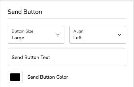
Edit the button (used to 'Send Form' or go to 'Next' page) size. The 'Block' option creates a wider block button.
Edit the positioning of the forms buttons and where you would like it to be displayed.
Send Button TextSend Button Text
Edit the 'Send' (submit) button text to match your forms theme.
Send Button ColourSend Button Colour
Edit the 'Send' buttons colour.
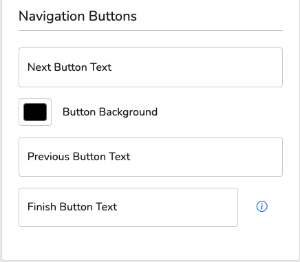
Navigation Buttons
Next Button TextNext Button Text
Edit the 'Next' button text to match your forms theme.
Button BackgroundButton Background
Edit the 'Next' buttons colour.
Previous Button TextPrevious Button Text
Edit the 'Previous' button text to match your forms theme.
Finish Button TextFinish Button Text
Edit the 'Finish' button text to match your forms theme. This button is displayed after the completion action.
Footer
The 'Footer' sub-heading allows you to customise the text at the bottom of your form. This can be used to include your email address so respondents can directly contact you regarding any queries.
Footer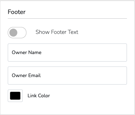
Show Footer TextShow Footer Text
Check or uncheck this box to show the footer text appearing centered at the bottom of the form. We recommend you display the footer text to provide a contact point for your respondents.
Edit the form owner name to be displayed within the footer.
Edit the form owner email to be hyperlinked to the owner name. When the name is clicked, a blank email will be automatically composed to the contact email provided.
Edit the hyperlink text colour to match your forms theme.
Themes
The 'Themes' sub-heading allows you to customise the theme of your form. You can save the current settings you have created to become a new theme, or you can upload a pre-made or pre-set account theme.
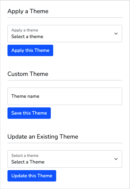
Edit the theme of your form by applying one of the global themes on your account or choose from one of your own themes.
Create a new theme by saving the current form appearance settings. To create a new theme with your current form appearance settings, click in the input box, enter the name you want to give your new theme, then click the 'Save' button.
Update An Existing ThemeUpdate An Existing Theme
Edit an existing theme by updating it with your current form appearance settings. To create a new theme with your current form appearance settings, click in the input box, enter the name you want to give your new theme, then click the 'Save' button.
Custom Styles
The 'Custom Styles' sub-heading allows you to input your own custom CSS code to apply to your form.
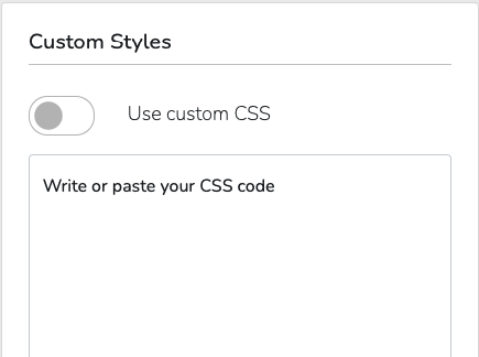
Enable this option to use the custom written CSS code below. You can write or paste in your custom CSS code in the text box provided.