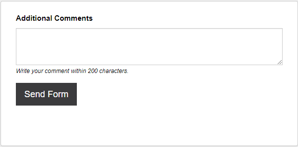
TextBox
A 'TextBox' question is an input box that allows the respondent to type anything into it. This question type can be used by the respondent to provide extended passages of information e.g. feedback, description of a subject, detailing. There are no 'Validation' settings available to fix the respondent to responding within a format.

Have a look at this question type in an example form.
Question Settings
Width (%): Edit the text box width by percentage. The default width is set to 100%.
Height (em): Edit the text box height by em. The default height is set to 5em.
Restrict: Edit the text input restriction to either 'Characters' or 'Words'. This works in conjunction the 'To Less Than' setting as it determines the amount of text that can be input.
To Less Than: Edit the amount of characters or words that is input up to 9999. This works in conjunction the 'Restrict' setting as it determines the text type that is counted.
Hide the Character/Word Counter Message: Enable this option to disable the character/word counter displayed in real time beneath the text box.
For Office Use Only:
The 'For Office Use Only' feature allows for administrative details to be added to this question from the back-end browser. The details may be made visible or invisible on the front-end form.
It can be used to provide updates regarding the form or a specific form entry. This is useful in situations where feedback upon the completion of a form is needed by the respondent . An update can be provided in this box if the specific form has been updated and new questions need to be answered.
This feature could potentially eliminate an extra email or message from the respondent to the form creator allowing more time for extra work elsewhere.
- Field Type: Edit the field type to either a 'Radio Button' (check select option) or 'Text Field' (simple input fields).
- Field Title: Edit the title of the additional fields e.g. Completed. Edit the ‘Field Title’ to something in relation to your ‘Field 1 Label’ and ‘Field 2 Label’ indicators.
- Field 1 Label: Edit the label above the first field.
- Field 2 Label: Edit the label above the second field.
Note! We recommend you label these two fields as positive and negative, to indicate a change when the respondent has come back to check for updates.
- Hide/Show these fields on the front end form: Set this option to 'Show' to allow the form respondent to see the For Office Use Only Additional Fields
Use Cases
Extra Options Box
Within some question types, you can 'Add an Other Box' which will display a single input box. You can add an extra options box for a select question when the respondent will have more than one 'other' option to include. This creates extra space for additional information regarding the 'other' option, or more than one option can be added.
Additional Comments Box
Gathering additional feedback for questions in your form can further improve your product or service. Respondent specific feedback on their experience allows them to express their opinion on what can be improved and what went well.
See Also
Not the question you were looking for? See the 'Question Types' topic to view all of the other types.